Portfolio

Matplotlib and ggplot2

Matplotlib PieBar

Python Matplotlib Pie + Grouped Bar Chart

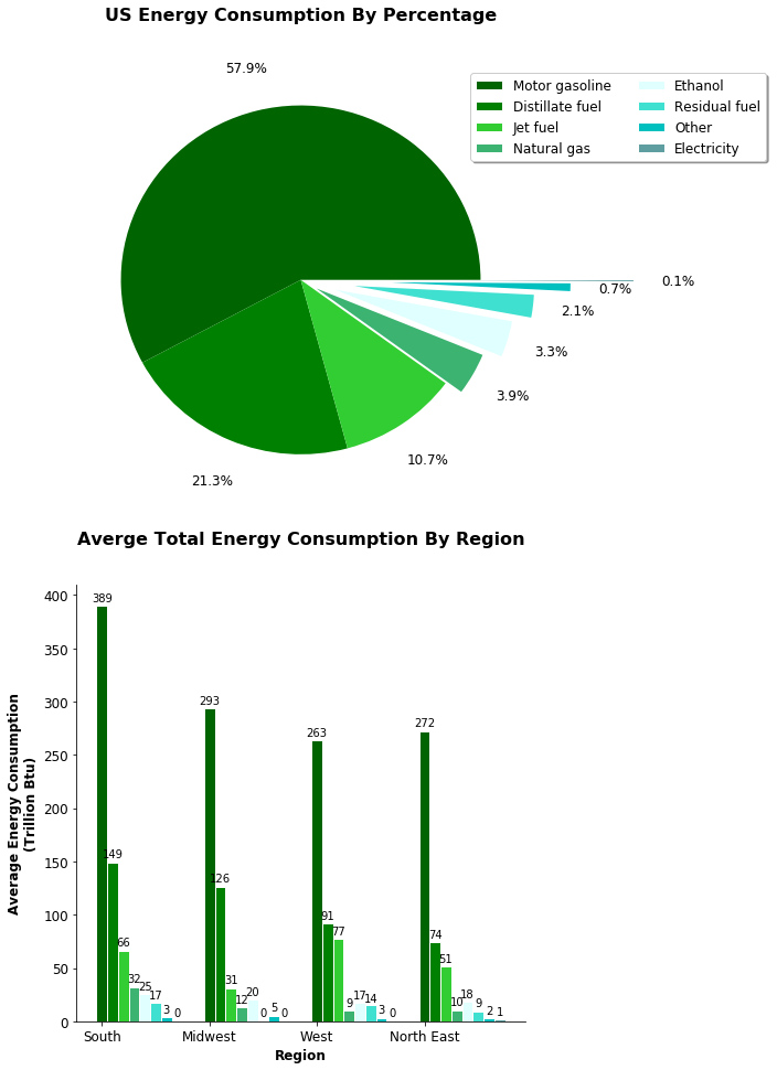
This plot contains one pir chart and one grouped bar chart.
The pie chart illustrates that among the listed energy types, "Motor gasoline" occupies the greatest consumption (about 57.9%), while "Electicity" has the least consumption (only about 0.1%) in the US.


The grouped bar chart shows that the Southern part of the US consumes more motor gasoline and distillate fuel than other regions do. The West part of the US consumes nore jet fuel than other regions do, which may inducate more air traffic in the that region.
ggplot2 correlation

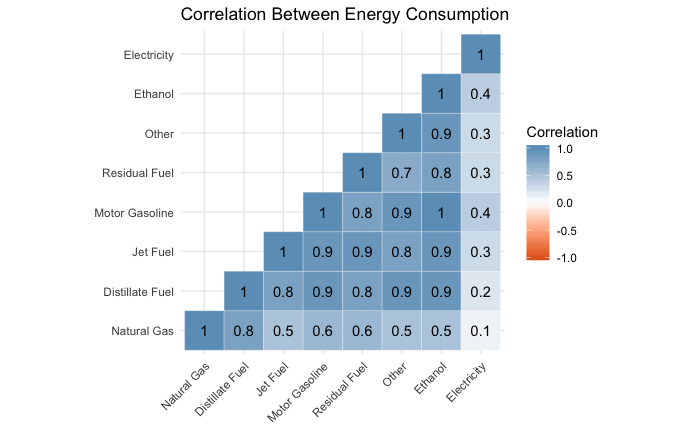
R ggplot2 Correlation

This correlation matrix illustrates the correlation between energy consumption, where most energy consumptions are highly correlated with others. For example, jet fuel and motor gasoline has a high correlation of 0.9, but most energy has weak correlations below 0.4 with electricity.

ggplot2 choloropleth

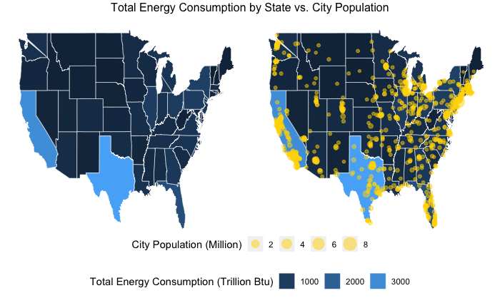
R ggplot2 Choloropleth

The choloropleth map one the leftside shows the energy consumption by State, which highlights the two States that have the highest energy consumtion: Taxes and California. The plot on the rightside integrates data of major city population, and illustrates how US are populated along the coastline.

Plotly (Upper: Python, lower: R)

This violin plot shows the variation and distribution of different energy consumption type. For motor gasoline, distillate fuel, jet fuel and natural gas, there exist long tailsindicating huge energy consumption differences among States, which may further imply huge gap of wealth between regions.